


Here’s the fifth in a series of blog posts written to help you evaluate elearning courses by considering how well their visuals add to the effectiveness of the training.
If you’re scoring from home, the four previous posts have covered:
- Organizing on-screen visual elements to ease perception
- Using visual elements to direct the viewer’s eyes
- Reducing the processing load by reducing realism
- Using visual displays to make abstract concepts more concrete
In this post, we’re going to demonstrate some ways that visuals can clarify complexity.
We didn’t invent these ideas. In fact, they’re standards of visual communication and graphic design. And the organizing structure for this series comes from the book Visual Language for Designers: Principles for Creating Graphics that People Understand by Connie Malamed. So, credit to the history of visual communication, of course, and credit to Connie Malamed. Check out her blog to learn more about instructional design and the book these ideas are drawn from, and keep your eye out for the new book she’s currently writing—we haven’t yet read it, but we already recommend it. She’s that good.
The visuals used as examples come from elearning courses created by Convergence Training.
Clarifying Complexity
You may think it’s good, or you may think it’s bad, but we all know it’s true: a lot of things in the world are complex. But that doesn’t mean people don’t have to learn about them.
Learning designers can help ease that learning by using visuals to present complexities. In some cases, it may be possible to simplify the complexity and focus in on only the essential core information. But in other cases, the visual will have to be complex as well.
When a complex visual is required to help convey complex information, this places greater demands on the viewer and may overwhelm their capacity to take in information. To make this easier for the viewer, and increase the chances that they’ll learn the required information, designers can use a number of different visual techniques. These include presenting information in step-by-step sequences and/or in “chunk-sized” segments, using special views that the human eye or a photograph couldn’t achieve, and taking advantage of the structure of the visual itself to either reinforce the meaning or to aid perception.
When using any of the three techniques, Malamed points out that the visual should be coherent and should provide context. Coherent means it should make sense—providing both the cause and effect, for example. And context means it should provide the information necessary for the viewer to understand—showing the full building and then using an insert to focus on a smaller detail, for example.
With the introduction down, let’s consider each of the three techniques.
Presenting Sequences and Segments
In some cases, a complex operation, process, or procedure can be present in a step-by-step manner. That’s a sequence. And in other cases, complex information can be presnted in small “chunks” within a single visual, with each chunk walking the viewer through smaller bits of information, perhaps in a “learn this bit, which lets you understand this next bit” order.
For example, the image below shows a three-step process for lifting safely (it’s based on a NIOSH poster). In some cases, of course, the procedure will be more complicated than lifting a box, but you get the idea.

In discussing sequencing, Malamed’s book gives a great example of a single graphic that explains Einstein’s Theory of Special Relativity. It presents different “chunks” of information, beginning with a scene-setting introduction, then presenting his famous “twin paradox,” moving on to a discussion of relative motion based on the viewer’s perspective, next comparing and contrasting Newtonian and Einsteinian concepts of time, then presenting the E=mc2 theory, and finally explaining the immense energy created when a small uranium-236 atom is split. That’s a lot of information, but it’s all presented in small, bit-sized chunks that help explain the “big picture” of Special Relativity.
Make Use of “Special” Views
The human eye is an amazing thing, but there are things it can’t see. Learning designers, though, can side-step that limitation by using visuals that side-step the limitations of ordinary site. Techniques include using interior views, cutaways, x-ray views, exploded views, magnified views, and views that imply motion within a still image. Again, lets look at some examples.
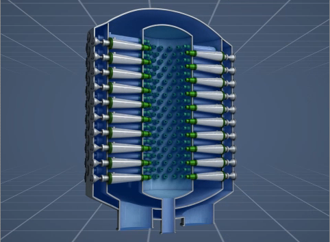
Interior views let the viewer see something “inside” that they couldn’t otherwise see. The examle below shows the smaller components within a machine. These would ordinarily be invisible, and seeing them this way would make it easier for the viewer to understand how the machine works.
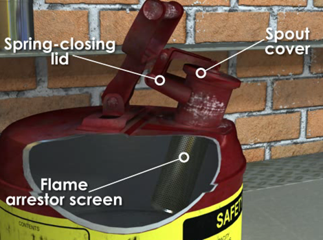
Or, to consider a similar but slightly different idea, the cutaway below is an effective way to label different parts of a device used to storm flammabl eliquids, both outside (the lid and spout cover) and inside (the flame arrester).
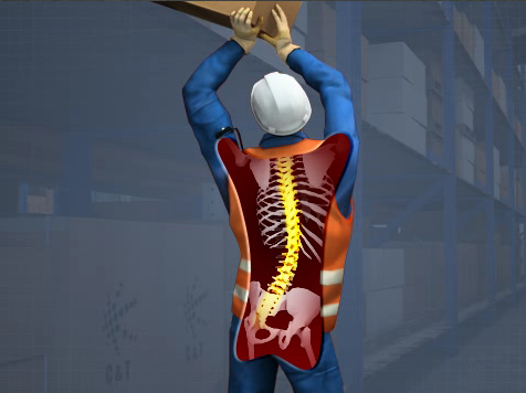
Yet another similar visual technique is the X-ray view. The graphic below highlights the strain put on a person’s spine when lifting objects in awkward positions.
Magnification is a way to show things that we ordinarily can’t see because they’re too small. For example, the image below shows the tiny fibers that join together to form paper.

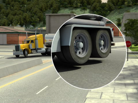
Below is another example of magnification. This example, taken from a course on preventing tanker rollovers, shows the ‘big picture’ view to set the scene and an insert to show a magnified detail of the critical information. This visual convention, which designers use and most people already recognize and understand, is one of the ways that designers “set the context” within an image, as mentioned at the beginning of this post.
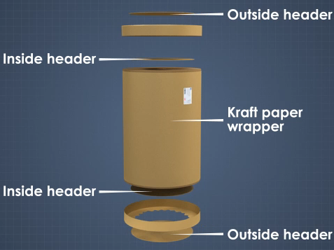
Exploded views—in which the smaller parts that make up a whole are separated and perhaps labeled, allowing the viewer to more easily recognize each—are another special view. The image below is an example of this, explaining the different parts of a roll of paper as delivered by a paper mill.
Another thing a designer can do is imply motion within a still image. For example, the arrows in the image below effectively explain the motion of the parts within a pump and the motion of the fluid through the line and the pump itself.

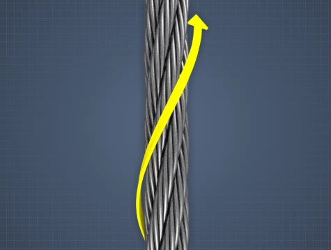
The image below, which explains the “lay” of a wire rope, doesn’t show active motion but does show the related concept of direction. The image is from a course explaining wire ropes, in particular from a discussion about the lay of a rope. Wire rope can have a right lay, in which the strands are wrapped to the right around a central core, or it can have a left lay, in which the strands are wrapped to the left. The arrow in the image effectively communications the direction of the wrap and therefore the lay.
Take Advantage of Structural Elements of the Visual
The last of the three techniques we’ll discuss has to do with the structure of the image itself.
In Malamed’s book, she gives two examples that are worth calling out here (and, as a reminder, we really recommend buying and reading her book). The first is a museum exhibit that presents biological evolutoin, with the silhouetted profiles of different organisms appearing on the familiar double helix that is the shape of DNA. The double helix helps to immediately set the scene for the viewer. The second is a graphic that explains the “structure” of a wetland, showing from top to bottom the sky, the surface, sub-surface water, subsurface rocks that hold the water, and finally roots. The top-to-bottom visual presentation mirrors the top-to-bottom arrangement in the real world, and helps orient the viewer.
Another way that a designer can take advantage of the structure of the image to aid the learner is to present theinformation in a way that makes it easier to compare and contrast different items or concepts. For example, the image below presents two visual explanations of two different ways manufactured goods can be loaded into a railcar—hot loaded or floor loaded. By placing one visual explanation directly above other, the designer makes it easy for the viewer to compare and contrast the two and zero in on the differences.

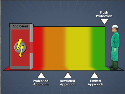
And finally, in the image below, the designer presents different “approach zones” in a course about arc flash. By presenting the zones in a horizontal, left-to-right orientation, the designer creates a mirror between the visual and the real-life distances these colored zones represent.
Wrappin’ it Up
Well, we hope that complexity is now clear as mud!
In the next post in this series, we’ll look at some tips for using visuals that create an emotional reaction in your learners. Until then, have a good one.
Jeff Dalto is an Instructional Designer and Trainer at Convergence Training. You can keep up with Jeff at the Convergence Training blog or on LinkedIn, Google+, Twitter, and Facebook.