


Yesterday the OpenSesame team had the distinct pleasure of hosting two real E-Learning Heroes, David Anderson and Tom Kuhlmann from Articulate, for a workshop in Portland, Oregon, our hometown. We had a great day, full of learning, discussion and treats like Stumptown Coffee and cookies.
Tom and David travel all over the country conducting these roadshows to share their ideas and models for making elearning accessible to anyone. As leaders of the Articulate community, both David and Tom work with thousands of elearning developers with widely varying backgrounds – from highly technical software developers to instructional designers to subject matter experts tasked with developing a course.
Typical eLearning Story
Tom & David kicked off the day by describing the typical evolution of elearning within an organization: Text-heavy PowerPoint decks become elearning courses with better design and perhaps a quiz at the end, which eventually become interactive experiences.
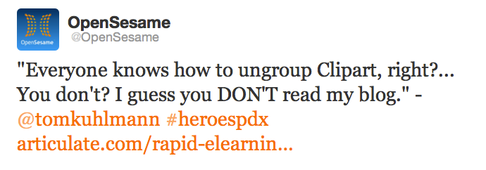
To enable anyone to become an E-Learning Hero, Tom and David spent yesterday describing their go-to development processes, structures for working with subject matter experts and rules of thumb for elearning design, culminating in an hour chock-full of PowerPoint tips (this resulted in the tweet above). All of this info is too much to cram into a blog post, but with great notes and analysis from my friend Abby Miles of BlueVolt, here are our favorite graphic design “nuggets” from yesterday’s session:
- Avoid the Franken-course: Often when elearning designers are just starting out, they sue everything all at once, ending up with too many fonts, mismatching images, (cartoony clipart combined with professional photos or blurry iPhone shots) and wildly mismatching colors. The piece de resistance: Animations and transitions gone WILD! To avoid the Frankencourse, decide on a consistent theme (more on this below) and stick with it!
- Fonts: Try to stick to 3 font styles (Title, Body, Accent) and go no lower than 20 point font. This has a dual purpose: First, font will be large enough for learners to easily read. Second, you won’t be able to cram too much text in the slide if you stick to a large font size!
- Colors: If you know nothing about color, try to stick to this structure: One main color, one background tone (that you can shift lighter and darker), and one complementary or accent color (something from the opposite of the color wheel from your main color).
- Design Trees are a great way to brainstorm design themes with subject matter experts or collaborators. This helps you build consensus from the beginning with partners and also to ensure your course is visually cohesive. To build a design tree, get your team together and brainstorm elements for each of these items:
- What colors evoke this course’s topic?
- What design elements, images and objects should appear in this course?
- Who are the characters who will appear?
- What font style should be used in this course? For example, fonts can be artistic, formal, silly, handwritten, etc.
- What movies or pop culture phenomena could we look to for inspiration? Are there any magazine design themes that are inspiring?
- Are there analogies or visual metaphors that could be used to explain or expand on the concepts in the course?
- Are there visual themes or concepts that could be included from related industries?
- Finally, one instructional design tip: Set clear expectations of the course for learners. This means giving them information about how long the course will take, making sure they know where they are in the course and what they should get out of the course.
In closing, if you ever have an opportunity to attend an E-Learning Heroes Roadshow, I highly recommend it. It was informative, useful and above all, practical – with useful tips for getting better at building elearning, today. For their upcoming schedule, you can always check Tom’s latest blog posts.