


If you’ve spent time on the internet you’ve probably happened upon an infographic (like this one or this one). These infographics offer awesome, creative, and visually appealing new ways to display information. They create the opportunity to turn a boring report or long article into something people want to read. We’ve seen, created, and loved infographics, and we want to share our love with you. If you’re ready to jump in and get started creating infographics, we’ve found a tool for you and created a course to teach you to use it!

What is Piktochart?
Piktochart is free web-based software that allows you to easily bring information to life. It offers you unlimited features and capabilities. You can create a whole new infographic from scratch using ideas from your own mind, or you can take one of the existing templates and make it your own. With every single part of the infographic moveable and adjustable you can truly create something unique. This easy-to-use interface allows for complete flexibility and creativity, giving you the opportunity to turn information into something visual and memorable easily and quickly.
How to Use Piktochart
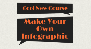
Despite the ease of the interface, using Piktochart requires a lot of experimentation; you can get lost in the options for hours. I created a course to help you get a jump start on the basics. Instead of discovering useful tools right when you’re about to complete your infographic (I could’ve locked that in place the whole time?!), let me walk you through the tools and features that Piktochart has to offer. Allow us to help you make infographic design and creation easier than ever. This approximately 20 minute FREE course provides you with everything you need to know!
Piktochart Templates

Piktochart Features and Capabilities

A Bit of Design Advice
Colors, images, maps, lines, and graphs are powerful tools when designing an infographic. Utilizing them in just the right way creates an awesome visual display of information. Unfortunately overusing any of these tools (ie including seven different colors in your color-scheme) runs the risk of cluttering your infographic. When an infographic gets cluttered, information gets lost. Just because it’s an image-based form of communication doesn’t mean you can forget about the information. Use maps only when they make sense, images only when they make sense, and graphs only when they make sense. If you’re throwing elements into your infographic willy-nilly you might be wasting them and making your infographic too busy. So when you’re creating an infographic think it out, make sure every element you use is used to make an impact!
So if you have a website, blog, or just want to make your information more interesting, try using Piktochart; we can help! Take our free course and get started today!